How Launch Media Studios looks, and why
A working reference for anyone making something with this brand on it. Everything here is what the live site actually uses, so if the two ever disagree, the site is right and this page is out of date.
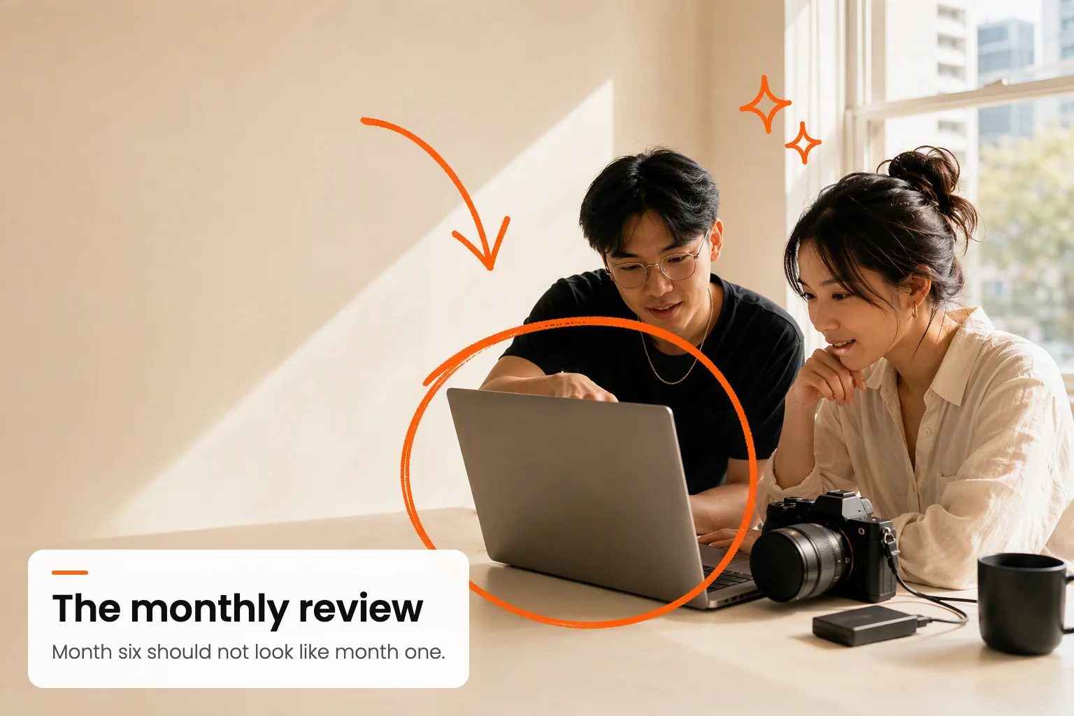
The idea
The brand has one job: look like a studio that makes things, not an agency that presents things. Everything below follows from that. The photography is warm and unstaged, the typography is calm, and then a single orange hand-drawn layer goes over the top, as if someone marked up the print on the way past.
That drawn layer is the whole identity. Strip it out and this is a competent minimal brand that looks like forty others. Keep it and the work is recognisable at a glance, at thumbnail size, in a feed. Protect it.
The one rule that matters most
Imagery: photoreal base, drawn overlay
Mixed media. A real photograph underneath, and one orange hand-drawn layer on top carrying both the marks and the words: a circle, an arrow, and a hand-lettered note saying what is happening and why it matters. Never illustration alone, never a bare photograph, and never an image without its words.
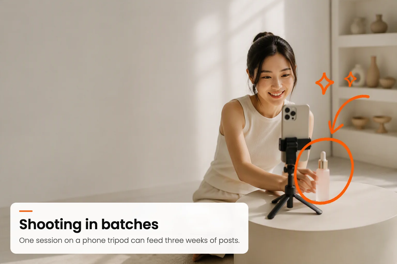
People at work, unposed
The default. A real person mid-task, never smiling at the lens. Faces stay clear of the drawn layer.
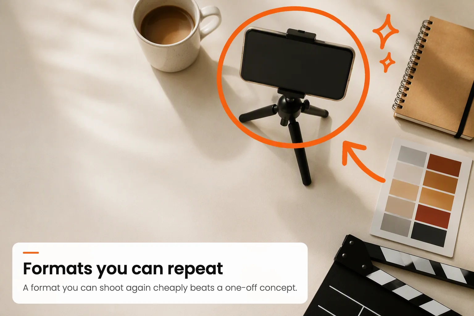
Overhead still life
For anything about process or craft. Warm off-white surface, real props, space between objects.
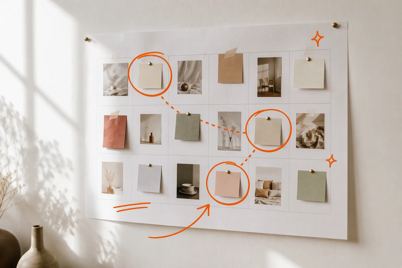
Evidence of the system
Calendars, boards, notes. Shows the discipline the copy claims without needing a chart.
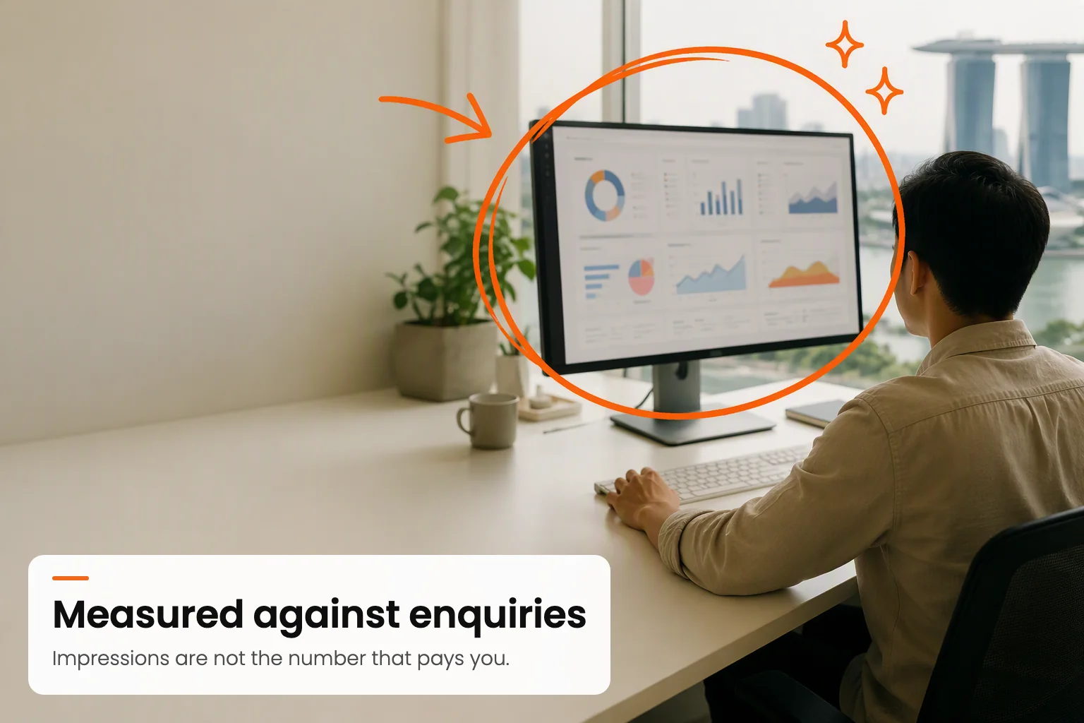
Screens, abstracted
Screen content stays unreadable on purpose. A legible dashboard invites scrutiny of numbers we are not claiming.
The photographic base
- Warm natural daylight only. No hard flash, no cool blue cast, no heavy colour grade. Window light doing the work.
- Warm neutral palette in frame. Off-white, sand, oatmeal, pale wood, the occasional plant. The photograph must never fight the orange, because the orange has to win.
- Generous negative space. Deliberate empty area, usually upper right, because that is where the drawn marks live. Compose for the annotation, not around it afterwards.
- Real and Singaporean. Real rooms, real props, people who look like they live here. No glass-tower stock, no headset call-centre imagery, no handshake photography.
- Unposed. Mid-task, looking at the work rather than the camera.
The drawn layer
- One colour only:
#f2681c. No second accent, no gradients, no shadows on the drawn marks. - A limited vocabulary: rough circle, curved arrow, underline, bracket or frame, small four-point sparkle. That is the entire set. Adding new mark types dilutes it.
- Three to five marks per image. More than that and it stops reading as annotation and starts reading as decoration.
- Never over a face. Never over the primary subject either. The marks point at things, they do not obscure them.
- Flat and graphic. The drawn layer must never try to look photographic, three dimensional, or lit.
Producing a new image
Images are generated with gpt-image-2 and the prompt below, then resized and converted to WebP before they go in public/img/. Keep it verbatim and change only the scene sentence and the two phrases, or the set drifts. Then read the result before you ship it.
Why the prompt forbids text and logos
Every image carries a label
An arrow and a circle can point at something. They cannot say what it is or why it matters. So every image carries hand-lettered words in the same orange marker: a short phrase in capitals naming what is happening, and a lowercase line under it giving the principle. The picture stops being decoration and starts teaching something.
The lettering is part of the drawing, not a caption laid over it. That is the whole point: it should read as though someone marked up the print, wrote a note in the margin and drew an arrow to the thing they meant. The photograph is composed for it, with the subject on the right and a calm empty area on the left.
The lettering is drawn, not typeset, and every one gets read
How to write one
- Headline: two to four words, hand-lettered capitals, naming the action or the principle. “SHOOT IN BATCHES”, not “OUR PROCESS”. Short phrases are also what the image model renders reliably, so brevity is craft and insurance at once.
- Concept: one sentence a buyer could repeat to a colleague. It should teach, and where possible it should cost us something to say.
- Never a caption of the obvious. If the line only describes what is visible in the photograph, it is wasted. Say the thing the photograph cannot.
- The alt text must carry both lines, or a screen-reader user loses the point of the image entirely. It is the only copy of those words a machine can read.
The full set in use
| Image | Label | Concept |
|---|---|---|
| hero | SHOOT IN BATCHES | one session, three weeks of posts |
| social | NATIVE VERTICAL | shot for the feed, not cropped |
| video | SETUPS, NOT HOURS | more setups, more cuts |
| content | FROM REAL EXPERTISE | interviewed, not invented |
| influencer | AUDIENCE OVER REACH | relevance beats follower count |
| cadence | PLAN A MONTH AHEAD | never the night before |
| group | MEASURE ENQUIRIES | not impressions |
| review | REVIEW EVERY MONTH | month six is not month one |
| flatlay | REPEATABLE FORMATS | cheap to shoot again |
| compare | NORMALISE FIRST | same price, different work |
| shortlist | SHORTLIST THREE | one teaches you nothing |
| budget | SHOOTING SETS THE PRICE | not the post count |
| writing | STRUCTURE TO BE QUOTED | clear answers, clear headings |
Colour
One accent, one near-black, three greys, two grounds. The restraint is the point: because there is only one colour, the orange means something wherever it appears.
Colour rules
- Orange never exceeds roughly a tenth of any layout. It is punctuation, not paint.
- Body text is never orange. One phrase per headline may be, and only one.
- Never use pure black or pure white. Ink and Paper are the extremes.
- No gradients anywhere, including on text. No second accent colour, ever.
Typography
Poppins throughout, at three weights: 700 for headlines, 600 for labels and buttons, 300 for everything you actually read. The 300 is deliberate. It is what keeps a page dense with information from feeling heavy.
Most brands do not have a marketing problem.
They have a publishing problem.
This is the lede. It runs at 300 weight and sits between the headline and the body, carrying the argument in one or two sentences before the reader commits to the rest.
And this is body copy, capped at roughly seventy-two characters a line so the eye can find the next line without effort. Long-form pages on this site run to several thousand words, so the measure and the line height do more work here than on a page that is mostly headings.
| Role | Size | Weight | Tracking |
|---|---|---|---|
| Display / H1 | clamp(36px, 5.4vw, 60px) | 700 | -1.9px |
| Section / H2 | clamp(26px, 3.6vw, 38px) | 700 | -1.1px |
| Subsection / H3 | 20.5px | 600 | -0.4px |
| Lede | 18.5px | 300 | normal |
| Body | 16.5px | 300 | normal |
| Caption | 13.5px | 300 to 600 | normal |
- Headlines carry negative tracking. At display sizes Poppins opens up, and it needs pulling back in.
- Body copy never goes below 15px or above 17px. Long documents live or die on this.
- Sentence case everywhere. Never all caps except the small uppercase labels, which carry 0.06em tracking.
- No em dashes in any copy, anywhere. Commas, colons, semicolons, full stops or brackets.
The mark
A capital L inside a hand-drawn circle. The circle is the same loose marker stroke that annotates every image on this site, so the logo is not decoration bolted onto the identity, it is the identity at its smallest size. It does not quite close, and it is not meant to.
It survives being small, which is the only test a mark has to pass. At sixteen pixels it still reads as a circled L rather than an orange smudge, and that is why this one was chosen over the alternatives.


Orange on light, white on ink. There is no third colourway. Download the orange SVG or the white SVG.
The lockup
Mark plus wordmark, set in Poppins 600, sentence case. The gap between them is roughly a third of the mark height, and the two are optically centred rather than mathematically aligned.
Launch Media StudiosClear space and minimum size
- Clear space: keep a margin of at least half the mark height on every side. Nothing enters that box, including the wordmark of another brand.
- Minimum size: 16px for the mark on screen, 8mm in print. Below that the counter inside the L fills in and it stops reading.
- On photography: place it in the negative space the image was composed to leave. Never over a busy area, and never inside a drawn annotation.
Icons and favicons
Two treatments, chosen by context. The bare mark is used wherever a transparent background is possible, because it stays legible smaller. The filled orange tile is used only where the platform demands a solid square, which is app icons and home-screen bookmarks.

favicon.svg
20px
16px

apple-touch

icon-192

maskable
Always ship the SVG
Shape and depth
- Radii are generous and consistent: 999px for pills and buttons, 22 to 28px for cards and panels, 16 to 20px for small tiles.
- Depth comes from one-pixel borders and the alternate ground, never from drop shadows. There is not a single box-shadow on this site.
- Sections alternate Paper and Paper soft to create rhythm down a long page.
- No glassmorphism, no gradient fills, no coloured left borders on cards.
Voice
Plain, specific, and willing to say the unhelpful thing. The brand's whole competitive position is that it tells buyers what other agencies will not, so the writing has to earn that in every paragraph.
- Say the number. If a price band is known, print it. Vagueness reads as evasion here.
- Include what costs us money. Every service page names a case where we are the wrong choice. That is not modesty, it is the reason the rest is believable.
- No invented proof. No client names, case studies, testimonials or results percentages until they are real. This is not negotiable and it is not temporary.
- No hype vocabulary. Nothing is game-changing, cutting-edge, best-in-class or revolutionary. No exclamation marks.
- Date and source any third-party fact, and link it so a reader can check it in under a minute.
What breaks the brand
Clean vector doodles
The drawn layer must look hand-made. Perfect geometry kills it.
Stock business photography
Handshakes, headsets, glass towers, laptop-and-coffee cliches.
A second accent colour
One orange. Adding a blue or a green makes it a template.
Drop shadows and glass
Depth comes from borders and grounds. Nothing floats.
Shipping lettering unread
Models garble words. Read every generated image before it goes near the site.
Marks over faces
Annotation points at the subject, it never covers it.
An unlabelled image
Arrows point but do not explain. Every image gets a headline and a concept.
Gradient text
Emphasis comes from weight, size or the accent colour.
Fake proof
No invented clients, numbers or testimonials. Ever.
Redrawing the mark
It is a traced hand-drawn stroke. A perfect circle with a perfect L is a different logo.
Recolouring the mark
Orange on light, white on ink. Never a third colour, never a gradient, never an outline.
Making something with this brand on it?
If anything here is ambiguous, ask before you ship it. It is faster than a redo, and the consistency is most of the value.
Message the studio